Graphic Identity
SuperCeed
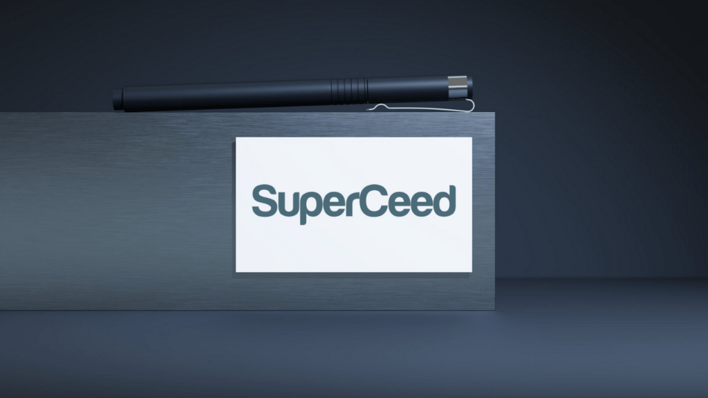
Logotype Design
Emelie Majling Graphic Identity
MADS – Majling Design Solutions
04/15/ 2025 – 04/25/2025 Graphic DesignDesign, Graphic Profile/Logotype Design
Mission and Background Story
As specialists in Unit4 ERP and Salesforce SuperCeed helps their customers increase the value of their investments in ERP systems and CRM.
SuperCeed wanted a new look and some new colors to use for their graphic profile to strengthen their brand.
For starters, they needed a new logotype.
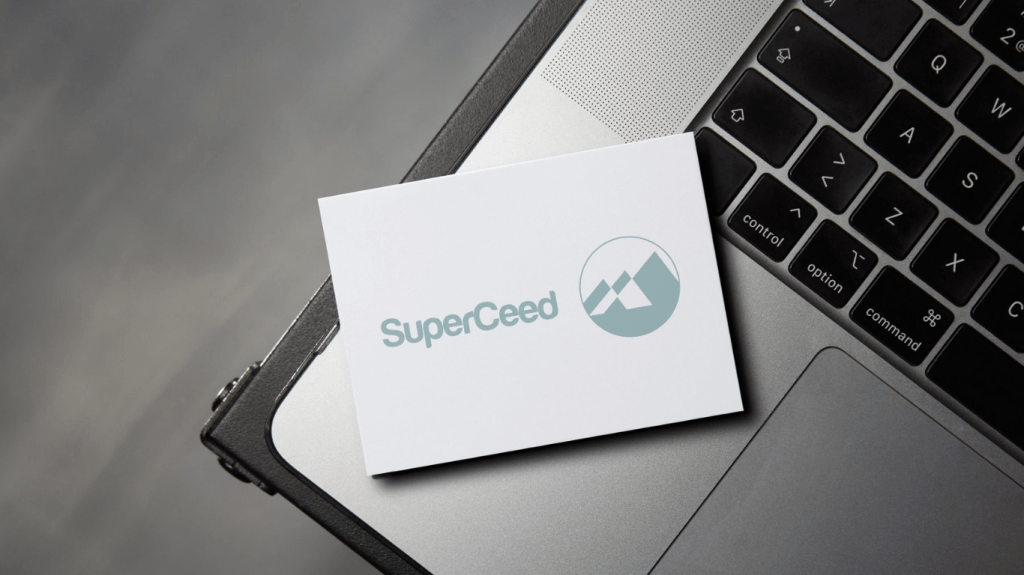
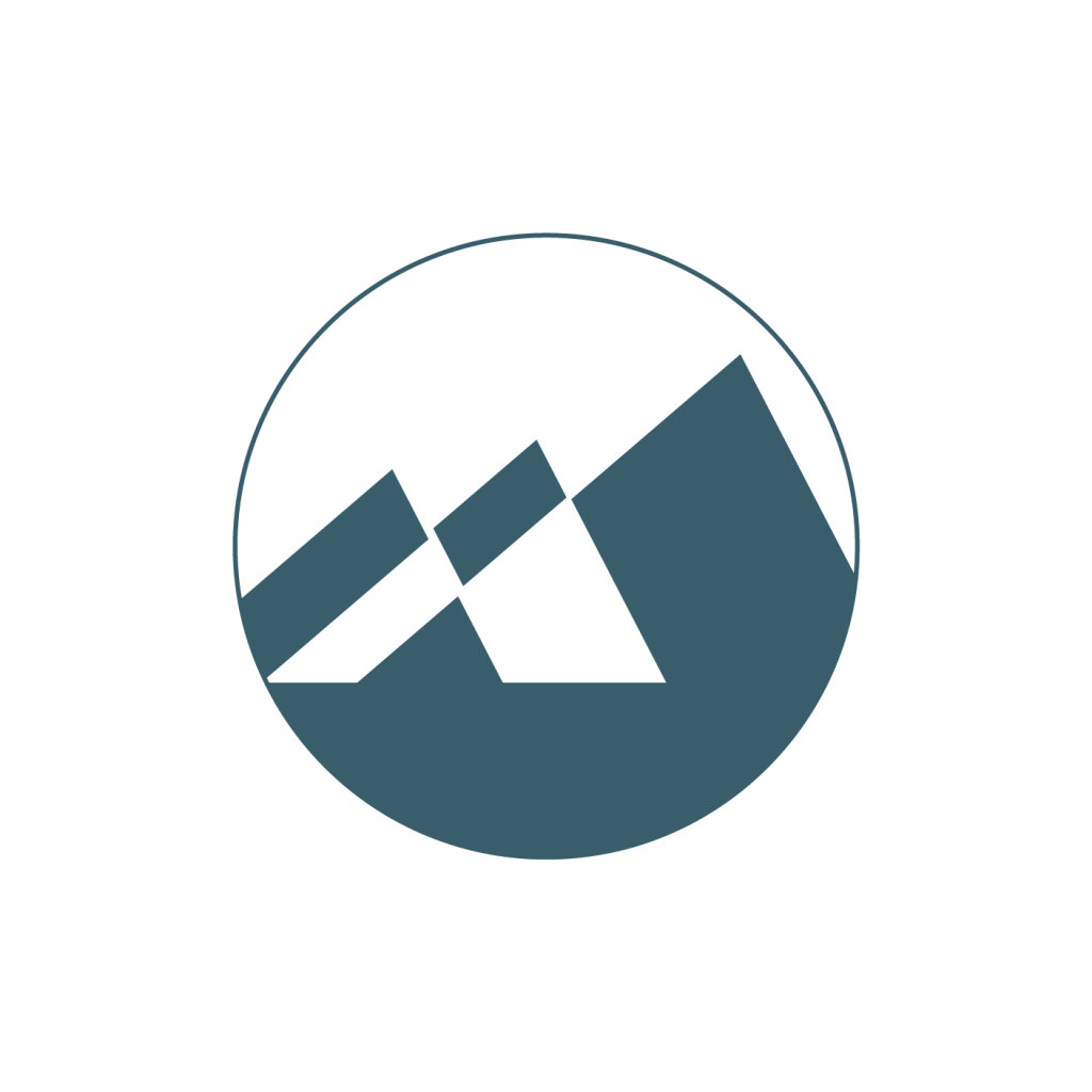
SuperCeed – Logotype
SuperCeeds meaning: To replace something, especially
something older or more old-fashioned, with something
better.
SuperCeed also stands for Security, Reliability, and Quality, and they wanted a Nordic look and feel.
The mountain symbolizes: Standing firm,
Reliability, and Security.
Lift your gaze! Up towards the mountain.
It can also be interpreted that the mountains are like
arrows up towards improvement and getting
to the next level!
SUPERCEED – Logo Font
Clean and Stylish Sans Serif font with round design and Nordic look.
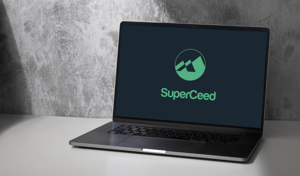
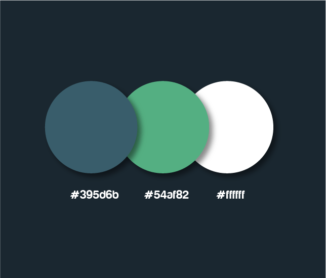
SuperCeed – Logo Colors
The colors are based on Nordic nature.
I chose the head colors for the logotype in a darker green-blueish tone that mixes nicely on light backgrounds but also stands out and fits with the graphic of the mountain.
The green works well as a contrast color on dark backgrounds.
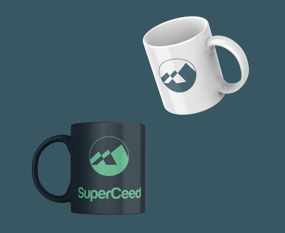
SuperCeed – Logo on Products
Logotype prints on Cups!
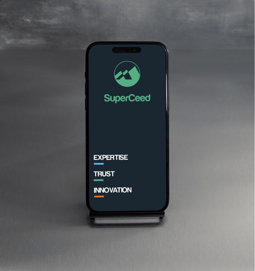
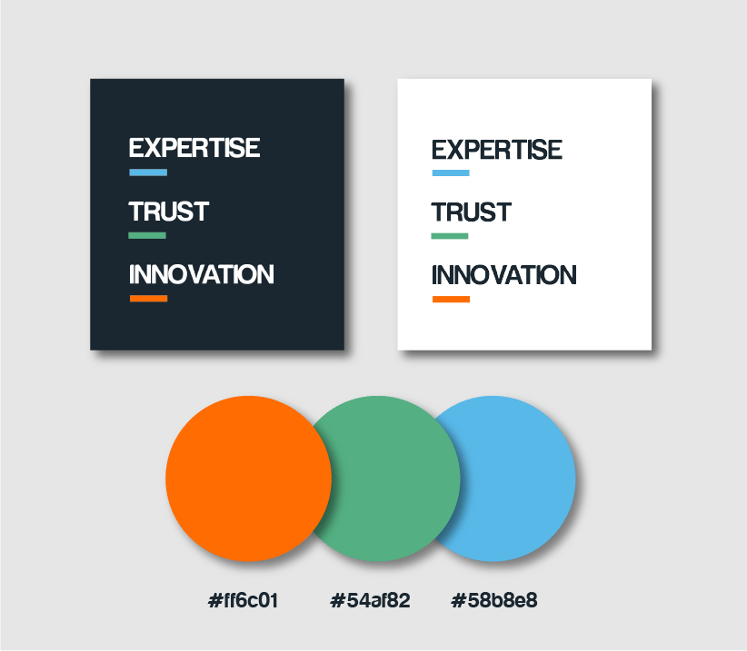
SuperCeed – Value Words
Graphic use of SuperCeeds Value words strenghted with their own color.
Responsive Interface Example
Example on how to use SuperCeed Logotype and value words together on a responsive interface.